

WAIT… before you copy and paste the last slide deck you or one of your colleagues used for a previous presentation (and probably 20 others that went before it) … please, please take a few minutes to read this blog before you continue – you’ll thank us later!
I remember creating my first ever PowerPoint presentation and having the luxury of a few weeks to play around with all the features and agonizing over which animations to use to make my presentation stand out. If I could give my younger self just one tip for PowerPoint presentations it would be this: fancy animations and many, many bullet points do not a presentation make.
Through experience we have almost become conditioned to unconsciously shudder at the thought of sitting through yet another slide deck. It’s become cool to - as the kids say, ‘throw shade’ on PowerPoint but in my opinion, unfairly so - why do we perpetuate the problem, it’s not a PowerPoint problem, we’re the problem.
I’m on a mission to help make PowerPoint loved again, so if you want to join me and create more engaging presentations that will be talked about for all the right reasons, read on…
If you’re impatient, head straight to our YouTube channel and watch our video Ten tips that will make you a PowerPoint Guru.
Branding
Before we even get on to how to present your content, any well-respected PowerPoint presentation needs to look the part. Here at Vevox, we’ve invested time and money in creating a functional yet appealing master slide deck that reflects our branding and style. The result? Better looking and more impactful presentations before we’ve even written a word. It might sound cheesy, but we genuinely love our slide deck, its seriously cool.
 If you don’t have the budget for a graphic designer to create a deck for you, most marketing departments will have a set of brand guidelines for you to adhere to and in these guidelines, you should find details of your company colour palette. PowerPoint has loads of theming and background options but don’t be tempted to dress your deck like a Christmas tree.
Please note: Prior to 21st March 2019, Vevox was formerly known as Meetoo.
Stick to two or maybe three of your company colours at most to keep things looking professional. When choosing your colours, it’s also important to bear in mind those who may have visual impairments, including colour blindness. Adobe Illustrator actually has 2 colour proof filters in the ‘view’ menu or try this Colour Blindness Simulator to adjust your images.
Animations and graphics

Image Source: Haikudeck
Here’s where it pays to spend a little extra time and exercise some caution. Animations and graphics can most definitely enhance a PowerPoint presentation, but they need to be used tactically.
One of the biggest bug-bear’s people have when viewing presentations is that the PowerPoint slides are too busy.
Hopefully you’re creating a presentation to share valuable and important information, so don’t distract from this with jazzy fonts, let the content do the talking.
Commonly, PowerPoint presentations are used as a form of reporting and presenters often like to include graphs and charts. If these are particularly complex, it can be hard for the details to be seen on a PowerPoint slide which is the point at which presenters will start to lose the attention of their audience. Consider whether your graph is really necessary or choose to pick out the key findings instead.
This being said, a picture paints a thousand words and with so many online sites offering royalty free images, its easier than ever to choose good imagery that will speak to your audience. When selecting images, be aware of equality and inclusivity and where possible, consider using real images from your organisation. If you’re ever in doubt check with your marketing department for usage rights and permissions and don’t forget to credit external sources.
The Vevox PowerPoint polling add-in offers a picture polling option, a real double whammy for keeping attention and driving your message home. As a little side note here, if you’re using a combination of text and graphical elements to your slides, don’t forget to use the arrange and align function in PowerPoint, this will help you to keep everything laid out neatly.
Bullet points
Similarly to the comma and the exclamation mark, bullet points are often misused. Its an easy mistake to think that breaking up your text with bullets makes it easy to read – it really doesn’t, in fact it can do the opposite.
Successful PowerPoint slides are the ones that are kept simple. Bullets should be reserved for lists of individual words or short phrases, not full sentences or paragraphs. Let that one sink in for a bit – you’ll start noticing this bad habit everywhere.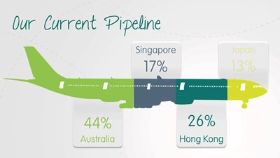
Image Source: PurePresentation
Keeping your audience’s attention can be a hurdle but keep them on their toes with a quick poll. Turn a list of words or phrases on a slide into a poll with our ‘Convert to poll’ button with the Vevox PowerPoint polling add-in. Bye-bye boring bullets…
Quantity vs Quality
There isn’t a magic number for the exact number of slides needed to make a successful PowerPoint presentation, it’s all relative. Bearing in mind the points we’ve covered so far, it’s important to keep only the essential information on each slide. The general consensus is that people would far rather read a greater number of clear and meaningful slides than fewer slides crammed with text in size 10 font. If you really want to emphasise a statistic, quote or even a PowerPoint poll with the Vevox add-in, allow it to have its own slide.
Timing
When it comes to delivering the presentation, it can be tempting to rattle through your PowerPoint slides to ‘get it over with’ but don’t bow to pressure to rush. If constructed with the points we’ve covered in mind, your presentation will be engaging and there won’t be any clock watching.
A word of warning: if you’re on a roll and your content is going down a storm, remember to allow enough time for the audience to review each of your slides. For most it will be the first time they have seen this information and it always takes longer than you might anticipate to read even the simplest of slides.
Look out for verbal and physical clues that people have finished reading your slide, including giving you eye contact, putting down their pen after writing or finishing typing. If in doubt, ask if it’s OK to proceed. As a bonus tip, if you’re using Vevox ask your audience to contribute messages or questions about your presentation to the Vevox Q&A board. Check this at regular intervals during your presentation for any feedback.
Shareability

Its commonplace for larger conferences to have their own hashtag now, which is great for joining in the conversation online, especially if you are unable to attend in person.
Often people in the audience take photos of keynote speaker slides to share on social media, so if you’re hoping your message will be shared online, think about designing slides that will look good when shared and include the event hashtag and your social handle on your slides.
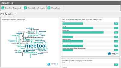 When using Vevox for PowerPoint polling, don’t forget to include the meeting ID on your slides to encourage people to participate. In our recent Summer Product Update we’ve also added a snazzy new feature to allow presenters to download their polling and word cloud results as images, this is so handy for sharing on social media or for creating reports.
If you’re presenting to a smaller group, print out some hard copies of your presentation to hand out (and to have as a backup) and prepare a PDF file that you can email out immediately afterwards. Also consider uploading to SlideShare or, if appropriate, add to your website as a gated resource for people to download which offers an opportunity for lead generation – make your presentation work extra hard!
And finally…
A slide deck is there to support the presenter and the message, but you have to deliver it, your slides shouldn’t do all the work – it goes without saying, reading verbatim from the slides is a huge no-no. Having a powerful PowerPoint deck is a huge part of running a successful presentation, but even a great deck can’t save a bad presenting style.
If you want even more PowerPoint tips watch our webinar recording.

-copy.png?width=723)

